Nº505 - Tahoe icons, Interaction and Mole
/ 1 min read
Table of Contents
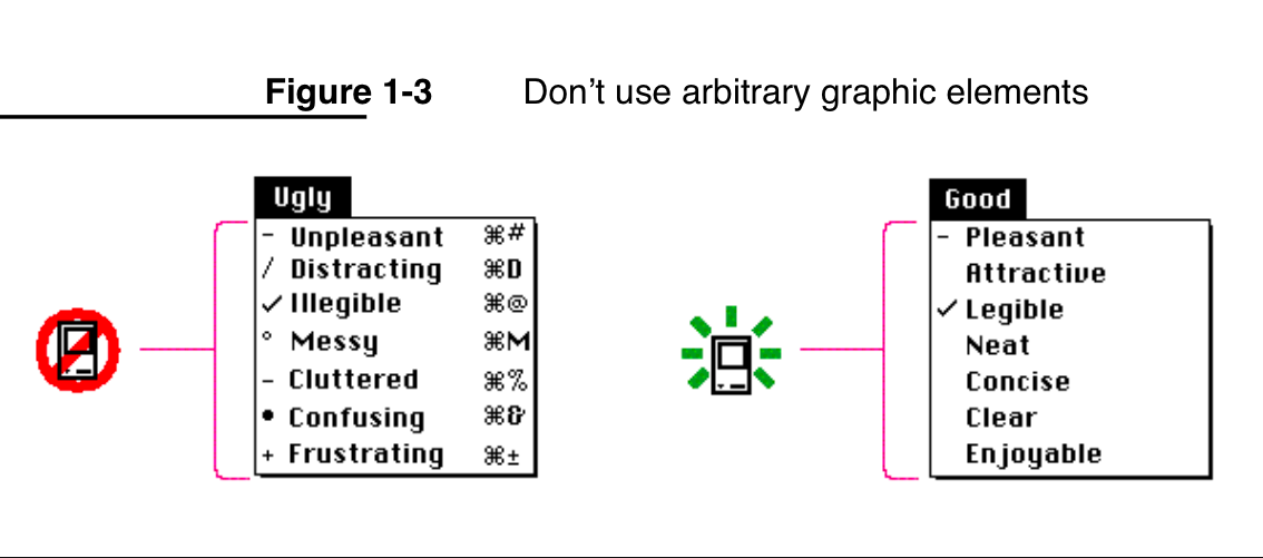
Featured image from the Macintosh Human Interface Guidelines from 1992. The It’s hard to justify Tahoe icons article argues that macOS Tahoe’s new menu icons are a usability regression: they are inconsistent, visually noisy, and often make commands harder—not easier—to find and understand.
Links of the week ending 16 January 2026
It’s hard to justify Tahoe icons (macOS Tahoe)
Figma Blog explores two decades of iconic interactions
Judgment from the ground up, critical thinking, subjective reasoning and decision making
Chris Cole Unveils His Signature Crimson “Skate or Die” Knife Made From Skateboard Decks
✨ and
Mole - Deep clean and optimize your Mac
Disclaimer
lotw.co.uk contains links to and from the third party websites. If you follow a link to any of these websites, please note that these websites have their own privacy policies and that lotw.co.uk does not accept any responsibility or liability for these policies. Please check these policies before you submit any personal data to these websites.