Nº508 - Ligatures, Accessibility and Olive Oil
/ 1 min read
Table of Contents
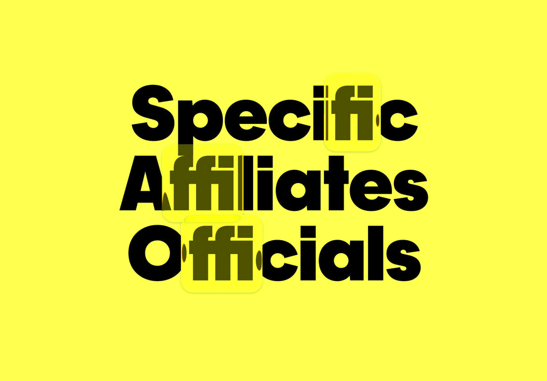
Featured image of ligatures in typography. Ligatures are special glyphs that combine two or more letters (like fi, fl, ff, ffi, ffl) into a single character to improve spacing, rhythm, and visual polish in typography. The article How to Use Font Ligatures explains what ligatures are, why they matter, and how to enable them in common design and office tools.
Links of the week ending 6 February 2026
Graphic Design History Resources at We Made This
Paper Trails: pre-war tourist maps from Japan self published book from Present&Correct
How an accessibility designer adds keyboard shortcuts to a web app
There is No Need to Trap Focus on a Dialog Element
Full control of The Ramones’ contentious legacy has finally been settled in court
✨ and
Olive oil sculptures for The New York Times on Instagram
Disclaimer
lotw.co.uk contains links to and from the third party websites. If you follow a link to any of these websites, please note that these websites have their own privacy policies and that lotw.co.uk does not accept any responsibility or liability for these policies. Please check these policies before you submit any personal data to these websites.